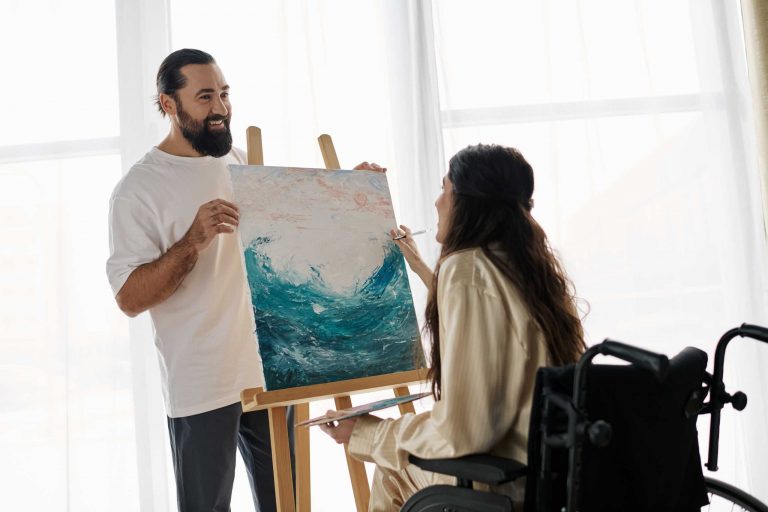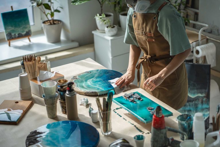

Exploring Color Theory in Watercolor: Making Your Paintings Pop
Understanding color is key to creating vibrant, harmonious watercolor paintings. Color theory might sound technical, but it’s really about how colors interact and influence the mood and balance of your artwork.
Why color matters:
Colors evoke emotions, create depth, and guide the viewer’s eye. In watercolor, where pigments are translucent, mastering color mixing and contrast becomes even more important.
Basic principles to know:
- Primary colors: Red, blue, and yellow — the foundation for all other hues.
- Secondary colors: Green, orange, and purple — created by mixing primaries.
- Complementary colors: Opposite colors on the wheel (e.g., blue and orange) that create vibrant contrast when placed side by side.
- Analogous colors: Colors next to each other on the wheel, offering harmony and softness.
Tips for using color effectively in watercolor:
- Start with a limited palette.
Using fewer colors helps maintain harmony and simplifies mixing. Try starting with just three primary colors and white. - Test color mixes.
Before applying paint to your artwork, experiment with blending colors on scrap paper to see the shades you can create. - Play with value and saturation.
Watercolor’s transparency means you can adjust how intense or pale a color appears simply by adding more water. - Use complementary colors to add vibrancy.
Placing complementary colors next to each other makes each color appear more vivid, adding energy to your piece. - Avoid muddy colors.
Mix colors carefully — too many mixed together can dull the vibrancy. Layering transparent washes instead of mixing all pigments at once keeps colors fresh.
Color moods to consider:
- Warm colors (reds, oranges, yellows) bring energy and warmth.
- Cool colors (blues, greens, purples) evoke calm and serenity.
- Neutrals and earth tones add balance and grounding.
Experimenting with color theory will deepen your understanding and boost your confidence in creating stunning compositions. Watercolor is perfect for this exploration because of its unique way of blending and layering.
Try creating a simple painting using only two or three colors. Notice how the colors interact and how you can create depth without relying on many hues.